
If a sharpened photo has pale outlines around hair, buildings or lettering, compare the same export with sharpening off. Keep crop, dimensions and JPEG quality unchanged. If the outlines disappear or become less conspicuous, use a lower sharpening setting rather than treating the extra contrast as recovered detail.
Adobe's sharpening guidance describes sharpening as increased edge contrast and warns about halos, jagged edges and noise. It also makes clear that sharpening cannot restore missing detail.
Look for an outline rather than a clearer subject
A useful edge can become easier to see without looking drawn on. A halo is more conspicuous: a pale border along a dark building, a dark rim around bright text, or a harsh outline following strands of hair.
Inspect a region where the source contains a clean high-contrast boundary. Compare the original, resized output and sharpened output at a similar scale. A naturally bright edge in the scene should not be mistaken for a processing artifact.
Also view the image at its intended size. A close crop helps diagnose the effect, but the delivery decision should include the actual presentation. More contrast that looks striking at 1:1 may look brittle in a small avatar.
Separate sharpening from missing focus
Sharpening changes relationships between existing neighboring pixels. It does not recover the exact texture missing from motion blur, a missed-focus capture or a tiny crop.
If the face was soft before export, locate a better original or choose another image. Raising the sharpening amount until noise and outlines become visible can make the file look more processed without making the subject more informative.
A larger JPEG is not proof of recovered detail either. It may simply store the newly emphasized edges or noise with more bytes.
Resize first for a useful comparison
A large master and a small delivery image need different inspection. Create the intended crop and dimensions, then evaluate whether a little output sharpening helps that copy.
This does not mean all creative editing must happen after resizing. Keep your normal editing project and prepare a separate delivery export. The point is to judge the sharpening at the size that will actually be used.
If you change the crop or dimensions between comparisons, you are testing more than one factor. A slightly different resample can change edges on its own, which makes the sharpening result harder to interpret.
Test off, light and a stronger setting
- Open the image sharpener and choose a clear original.
- In Custom, set the intended dimensions and output format. Set the byte cap to 0 (off), then keep quality, crop and dimensions unchanged for this comparison. An active cap can change encoding quality or shrink dimensions as sharpening changes.
- Set Sharpen to Off, export and keep that file.
- Set Sharpen to Light and export the same source again.
- If useful, compare Medium or Strong without changing anything else.
- Inspect hair, lettering, smooth backgrounds and noisy shadows in every version.
The controls are relative choices in this tool. They are not a universal amount or radius shared by every editor. Copying a number from another application does not guarantee an equivalent result.
The tool processes the file locally. It does not send the photo to a sharpening service or use an image-generation model to invent missing features.
Compare actual Off, Light and Strong exports
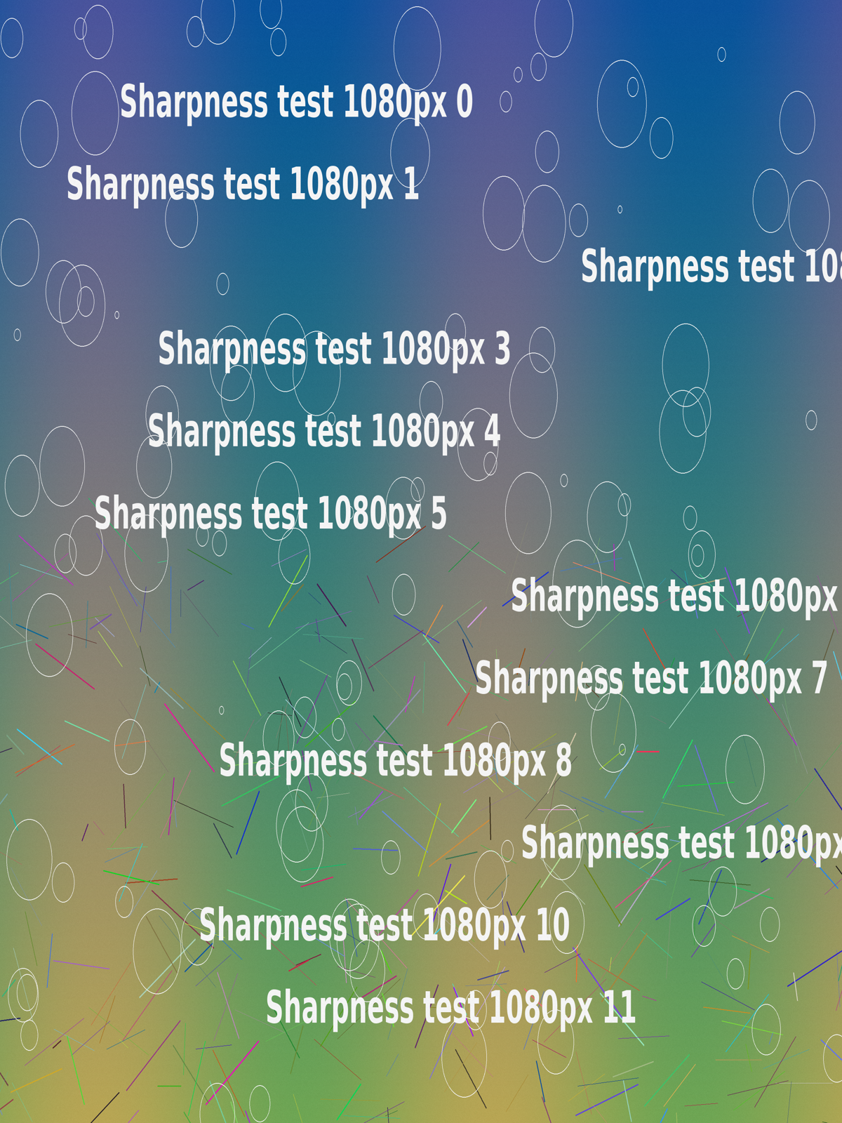
This controlled example uses our original synthetic test image, not a camera photograph. Each full export uses Custom, Keep original pixels, PNG and Target KB 0. The source and every downloaded result are 1200 × 1600. Only the sharpening selection changes. The quality slider stays at 90, but it does not control PNG encoding.
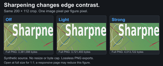
The figure shows the same 200 × 112 rectangle from each actual download: 250 pixels from the left and 1288 from the top. There is no crop enlargement, resize or lossy encode in these displayed samples. Open the full-size figure for one image pixel per figure pixel; the page can reduce it on a narrow screen.
| Sharpening | Download the 200 × 112 crop | Full tool PNG, 1200 × 1600 |
|---|---|---|
| Off | Lossless PNG crop, 41,398 bytes | 3,381,098 bytes |
| Light | Lossless PNG crop, 45,154 bytes | 3,721,493 bytes |
| Strong | Lossless PNG crop, 49,112 bytes | 4,013,722 bytes |



Compare the background texture and thin colored lines as well as the white lettering. Strong makes variations more pronounced in this fixture; it does not add a new feature or recover missing focus. Off already contains readable lettering. A stronger setting is not automatically a more useful result.
The Off crop matches the decoded source pixels in this rectangle. All three cropped downloads match their respective full tool outputs, and the lossless WebP figure preserves those crop pixels. The full PNG files were downloaded for verification and then discarded; the linked crop files are the retained samples. Even Off produced more bytes than the 2,301,362-byte source PNG, so file weight alone does not measure added detail.
The sharpening manifest records the full-output hashes and bytes, retained crop hashes, settings and implementation. These exports used Chromium 151.0.7922.34. The reproducible generator checks decoded pixel identity and keeps the comparison at 1:1. This is a local tool experiment, not evidence of how Instagram or another service delivers an image.
Watch texture and noise together
Fine fabric, foliage and sensor noise can all look more pronounced after contrast enhancement. Decide whether the actual subject becomes more useful or the whole image merely becomes busier.
Smooth skin and large gradients can reveal a different problem. Edge enhancement may make small variations look rough. If that is not what you want, reduce it rather than applying another lossy export on top.
This compressor is not a selective retouching editor. It does not isolate eyes from skin or sharpen one object while protecting another. Use a suitable editor if you need that level of control.
Text and logos often need restraint
Graphic lettering already has sharp transitions. Strong sharpening can outline characters and make colored edges look dirty. Compare PNG with sharpening off when the destination accepts it.
The text-image guide explains why making the words larger or simplifying the design can help more than increasing sharpening. A slogan too small to read does not become legible merely because each letter has a stronger border.
Only PNG output here retains existing transparency. JPEG and WebP flatten onto white. Do not confuse the white background around a transparent logo with a sharpening halo; these are separate effects to inspect.
Do not build from an already harsh export
If the source has halos from a previous edit, switching this tool's sharpening off does not reconstruct the unedited image. Return to the camera original or the project before that adjustment.
Keep one master and make separate delivery copies. Repeated JPEG exports can introduce additional changes, especially when resizing or changing settings. The JPEG quality guide explains why exporting a damaged file at a high quality does not repair it.
Save filenames that identify the comparison, such as portrait-off and portrait-light. This makes it easier to choose the intended version in a social application's picker.
Check the platform result separately
Use the Instagram sharp-photo workflow for crop and posting checks. A local sharpening decision cannot guarantee how every platform displays or processes the copy.
Compare the actual post at a similar size before deciding to strengthen the next export. If you alter sharpening, dimensions and app settings at once, the next result will not tell you which change mattered.
For an exact comparison record, note the source, browser, dimensions, format, quality and sharpening choice. The comparison guide provides the wider workflow.
Limits and checklist
Sharpening cannot reconstruct focus, eliminate every previous artifact or certify a lossless social upload. There is no universal strongest setting that makes every image better.
- Compare the same source and output dimensions.
- Start with sharpening off and light.
- Inspect outlines, noise and the real subject.
- Judge both 1:1 detail and the intended display size.
- Return to the original when previous edits are already harsh.
- Keep a clean master and a clearly named delivery copy.
Source review: 20 October 2026. References: Adobe sharpening overview and Unsharp Mask controls. The workflow describes this tool's relative controls, not a new cross-editor or platform benchmark.